Bayesian Linear Regression part 4: Plots

Now I have priors on the weights and observations, and I used this to come up with the mean and variance of the posterior on the weights. In this post, I’ll show some cool plots.
Set up
You can skip to “sampling from the posterior”! This computes V_n again using the code from the last post.
# Set up the prior
mu_w = 0
mu_b = 0

sigma_w = 0.2
sigma_b = 0.2

w_0 = np.hstack([mu_b, mu_w])[:, None]
V_0 = np.diag([sigma_b, sigma_w])**2

# Get observations
true_sigma_y = 0.1
true_w = np.array([[2, 0.3]]).T

X_in = 2 * np.random.rand(11, 1) - 1

Phi_X_in = np.hstack((
    np.ones((X_in.shape[0], 1)),  # pad with 1s for the bias term
    X_in
))

true_sigma_y = 0.05
noise = true_sigma_y * np.random.randn(X_in.shape[0], 1)

y = Phi_X_in @ true_w + noise

# Compute the posterior
sigma_y = true_sigma_y  # I'm going to guess the noise correctly

V0_inv = np.linalg.inv(V_0)
V_n = sigma_y**2 * np.linalg.inv(sigma_y**2 * V0_inv + (Phi_X_in.T @ Phi_X_in))
w_n = V_n @ V0_inv @ w_0 + 1 / (sigma_y**2) * V_n @ Phi_X_in.T @ y
Quick aside
Above I plot a 2D array to plot multiple lines, which makes matplotlib create a lot of duplicate labels. I’m not sure if plotting matrix is a bad idea to start with, but I did it anyway and used a helper function to deduplicate labels.
Sampling from the posterior
Much like how I sampled from the prior, I can sample weights from the posterior.
grid_size = 0.01
x_grid = np.arange(-1, 1, grid_size)[:, None]
N = 100

Phi_X = np.hstack((
    np.ones((x_grid.shape[0], 1)),  # pad with 1s for the bias term
    x_grid
))

w = np.random.randn(N, 2) @ np.linalg.cholesky(V_n) + w_n.T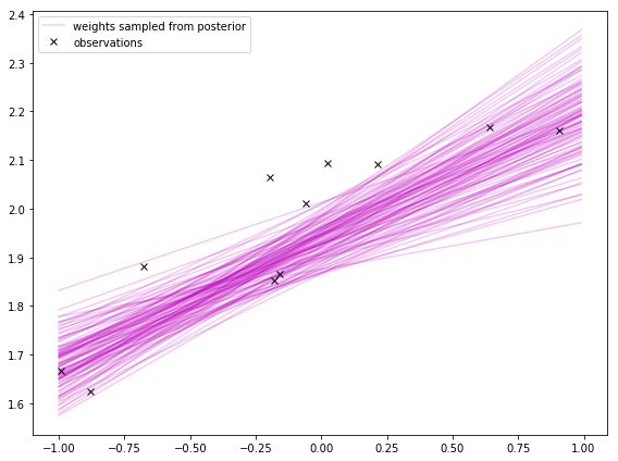
Prediction with uncertainty
I can also use V_n to compute the uncertainty of predictions. The prediction is the true function with some added noise:
where \(v \sim \mathcal N(0, \sigma_y^2)\). With a little math, I can compute the mean and variance of the prediction posterior’s Gaussian distribution. It’s also given in the course notes.
Then I can take the square root of that to get the standard deviation and plot 2 standard deviations from the mean. In code:
grid_size = 0.01
x_grid = np.arange(-1, 1, grid_size)[:, None]

Phi_X = np.hstack((
    np.ones((x_grid.shape[0], 1)),  # pad with 1s for the bias term
    x_grid
))

stdev_pred = np.sqrt(np.sum(np.dot(Phi_X, V_n) * Phi_X, 1)[:, None] + sigma_y**2)

upper_bound = Phi_X @ w_n + 2 * stdev_pred
lower_bound = Phi_X @ w_n - 2 * stdev_pred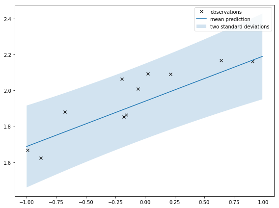
Neat!
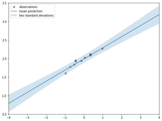
If I zoom out like I do below, it’s clearer that the shaded area is squeezed around the observations. That’s saying there is less uncertainty around where the observations are. That’s intuitive; I should be more certain of my prediction around observations.
Comparison
The difference between these two plots confused me at first but sorting it out was instructive.
In the first plot, I’m sampling from the distribution of the weights. I hear sampling from the weights’ distribution is not always easy to do. It turns out to be easy when doing Bayesian linear regression using Gaussians for everything.
The second plot shows the distribution of the prediction. This is related to the distribution of the weights (equation from the course notes):
If I look at a single weight sampled from the weight’s posterior, I can plot \( p(y|\mathbf x, \mathbf w) \) which for each \(\mathbf x\) is \(\mathcal N(y; \mathbf w^{\top} \mathbf x, \sigma_y^2)\). If I plot it, I get:
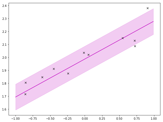
To get the prediction, I use the integral, which does a weighted sum (or expectation!) over a bunch (all) of these. Then I get:

Bonus: basis functions
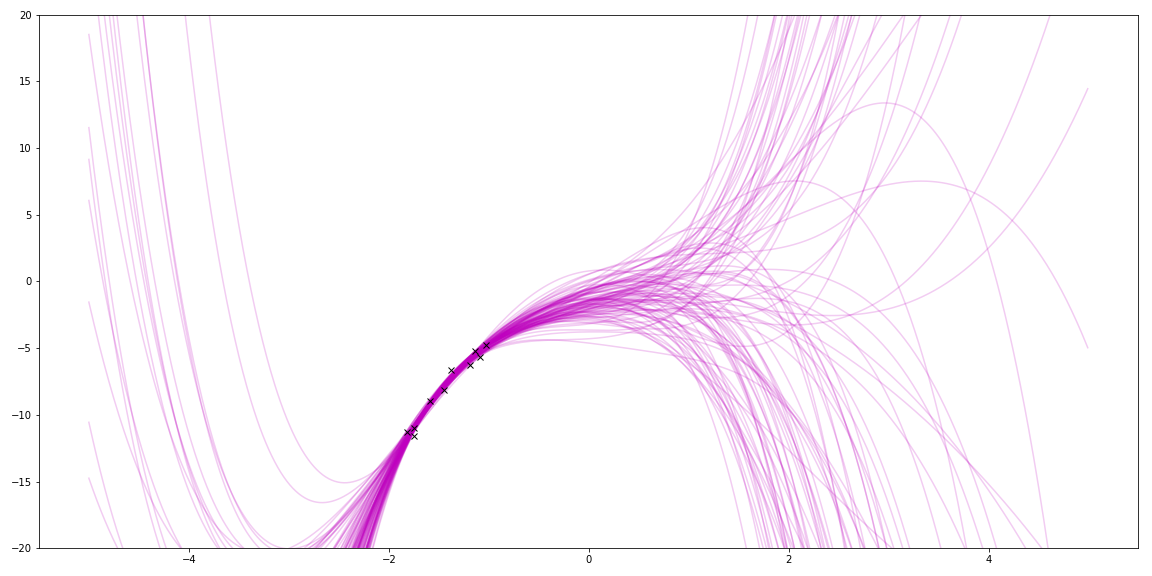
With linear regression, I can also use basis functions to match even cooler functions. For fun, I tried polynomials by using a different \(\Phi \). The true function was a quadratic. This shows trying to fit a 5 degree polynomial to it:
model_params = 6  # highest degree + 1
Phi_X_in = np.hstack(X_in**i for i in range(model_params))
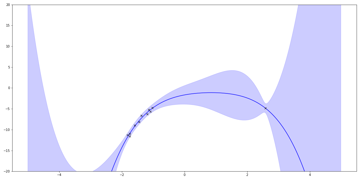
Sampling priors gave me lots of squiggles. (It also reminds me of my hair a few years ago!)
I can plot the uncertainty.
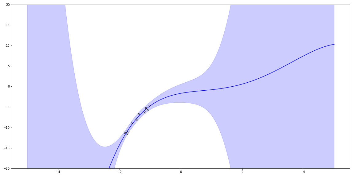
I also can add a few more points from the underlying function and see how it changes.
